
💡What You'll Learn
- Why users leave in seconds
- How confusion kills trust
- Why clarity beats power
- The danger of too many features
- Why onboarding isn’t the solution
Let me say this plainly no soft language, no sugarcoating.
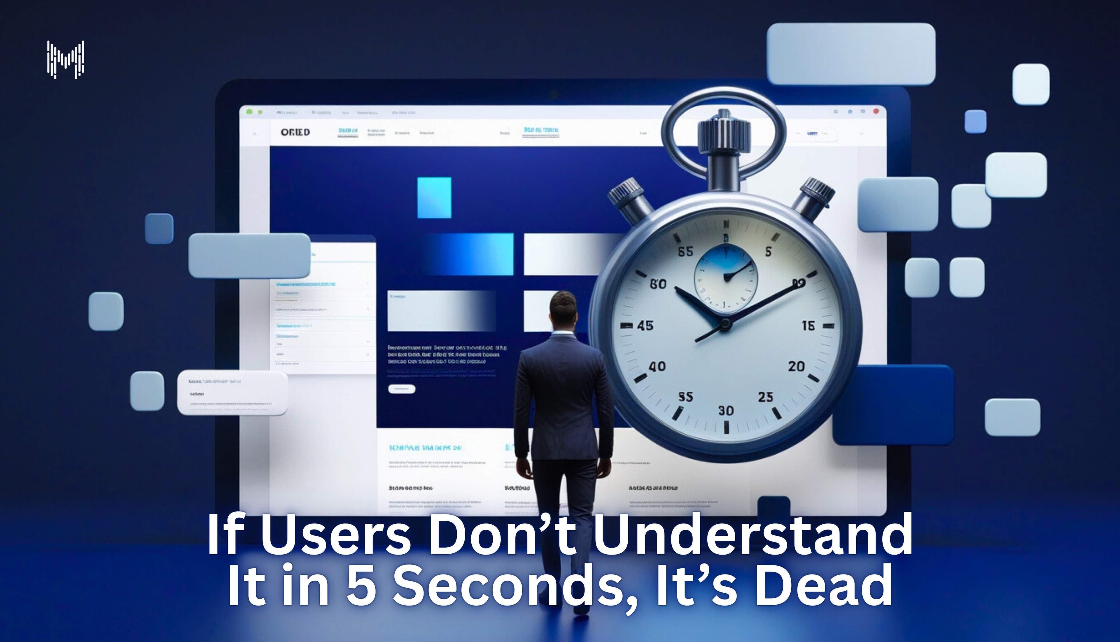
If someone opens your website, app, or product and doesn’t immediately understand what it is, what it does, and why they should care, it’s already dead.
Not “they’ll explore.”
Not “once they onboard.”
Not “after a demo.”
Dead
And yes, that sounds harsh. But it’s also the truth most teams avoid because it’s uncomfortable.
We like to believe users are patient. Curious. Willing to give us time because we worked hard. They’re not.
They’re tired. Distracted. Overstimulated. And they owe your product nothing.
Nobody Wakes Up Wanting to Learn Your Product
Here’s the part that hurts the most for founders and product teams:
Users don’t come to your product to understand it.
They come to solve something.
They land on your page while:
- Scrolling on their phone,
- Half-watching something else,
- Between meetings, or already annoyed by three other tools.
- And within seconds sometimes less one question runs through their head:
“Is this for me, or not?”
That’s it.
No curiosity phase.
No deep thinking.
No benefit of the doubt.
If the answer isn’t obvious, they don’t investigate.
They don’t complain.
They don’t leave feedback.
They just leave.
Quietly.
Forever.
“But Our Product Is Powerful” (So What?)
I’ve worked on products that were genuinely strong.
Smart teams.
Solid technology.
Good intentions.
Months (sometimes years) of effort.
And still users didn’t get it.
Why?
Because power means nothing if it’s hidden behind mental effort.
Dashboards packed with data.
Features stacked on features.
Copy that sounded impressive but explained nothing.
Inside the team, everyone understood it perfectly.
Outside the team, users felt lost.
And here’s the thing most teams underestimate:
Confusion kills trust faster than bugs do.
If someone has to think too hard just to understand the basics, they won’t stay long enough to see how powerful your product actually is.
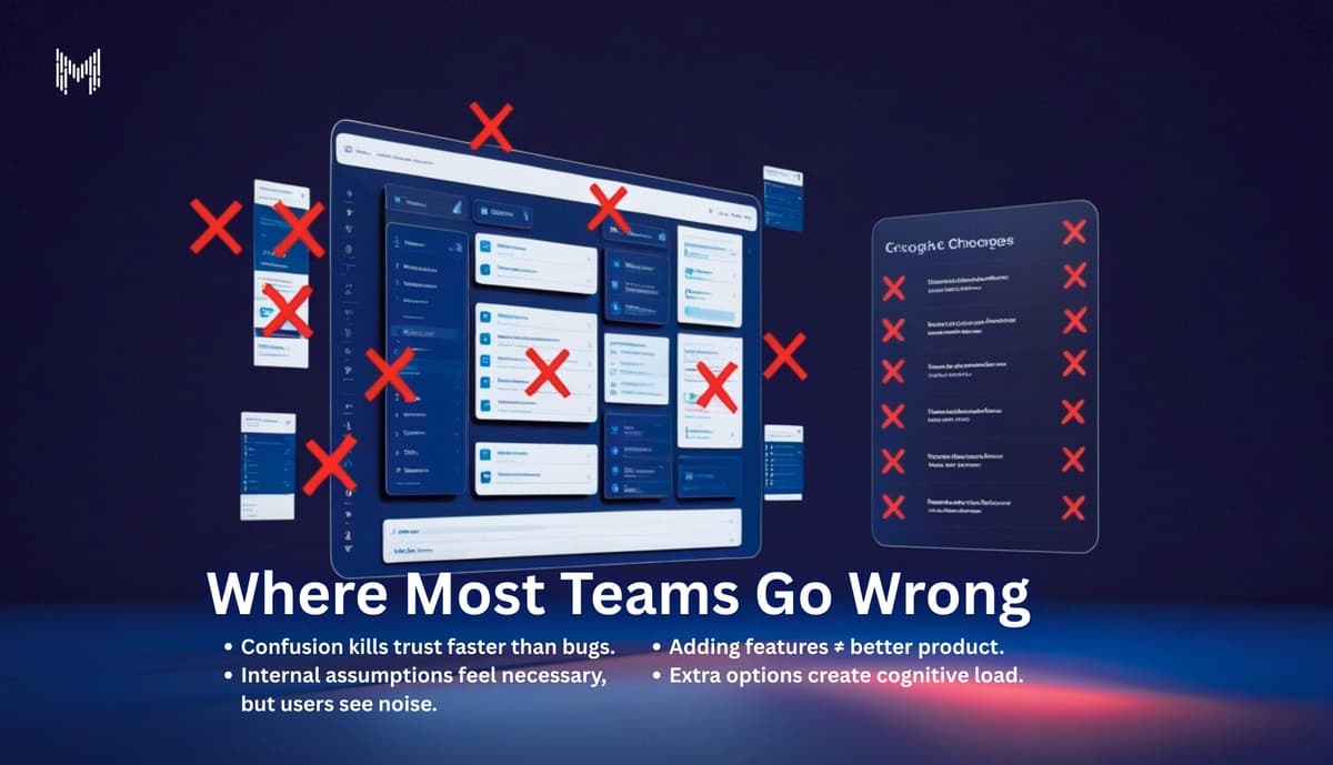
Where Most Teams Go Wrong (Without Realizing It)
This is a pattern we see again and again.
Teams confuse working hard with working right.
So they keep adding:
- one more feature.
- one more screen.
- one more option.
- one more “nice-to-have.”
- Because internally, it feels like progress.
But from the user’s side?
It feels like noise.
More choices don’t make products better.
They make decisions harder.
And when decisions feel hard, people don’t decide they avoid.
That’s not bad UX.
That’s basic human behavior.
Onboarding Isn’t the Fix You Think It Is
This might step on some toes, but it needs to be said:
If your product needs a long on-boarding flow just to explain what it does, the problem isn’t on-boarding.
The problem is the product.
Onboarding should help users move faster, not help them understand the fundamentals.
The best products don’t explain themselves loudly.
They explain themselves quietly through structure, clarity, and flow.
If your interface needs tool-tips everywhere, something upstream is broken.
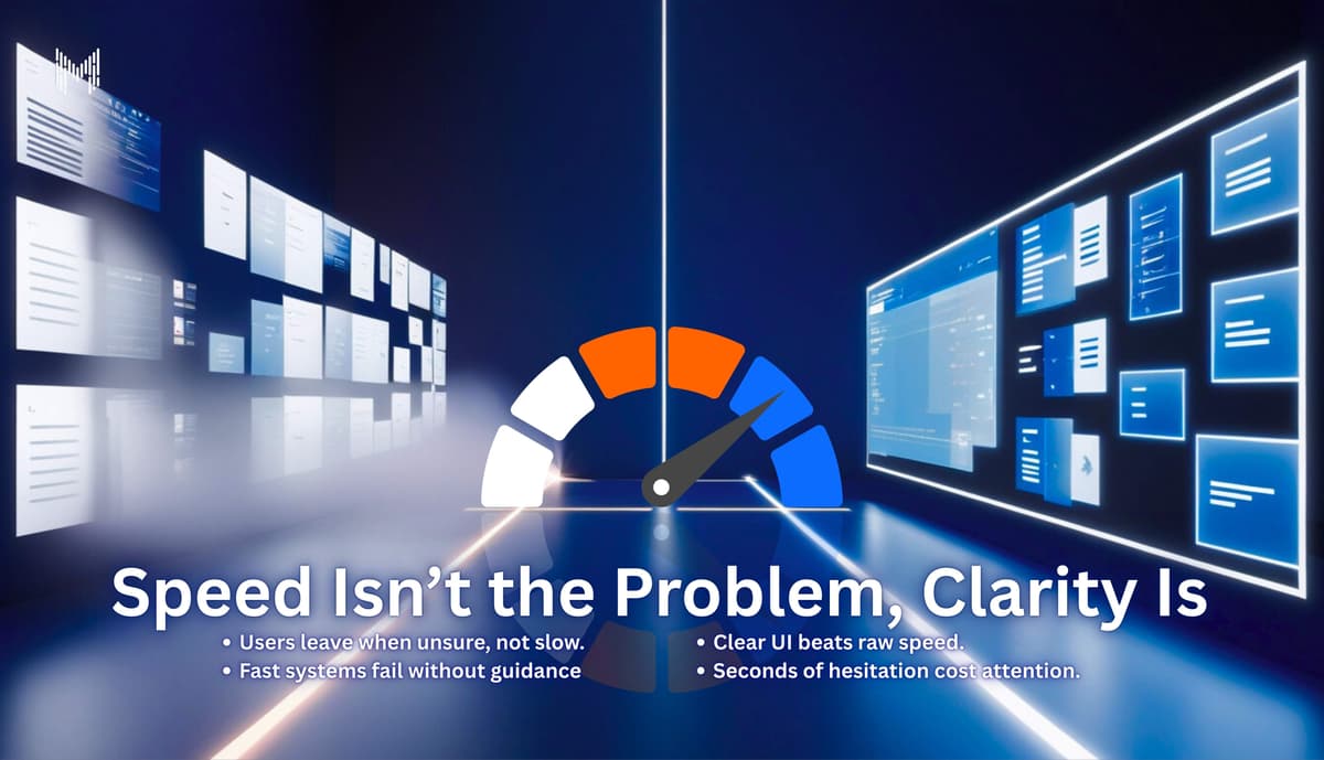
Speed Isn’t the Problem. Clarity Is.
A lot of teams assume users leave because things are slow.
Sometimes that’s true.
But more often, users leave because they’re unsure.
They don’t know:
- where to start,
- what to click,
- what happens next,
- or what value they’ll actually get.
- So they leave.
Not because they hate your product.
But because they don’t want to figure it out.
Startups Don’t Fail Because of Competition
This is debatable and that’s intentional.
Most startups don’t fail because a competitor was better.
They fail because users never understood them.
The market doesn’t reward effort.
It rewards clarity.
A simpler product with clearer messaging will beat a “better” product that feels confusing every single time.
The Best Products Feel Obvious (And That’s Not Luck)
Think about the last product you loved using.
You didn’t need:
- a tutorial,
- a walkthrough,
- or a call.
- You just knew what to do.
That’s not accidental.
Someone made hard decisions so you wouldn’t have to.
They removed instead of added.
They chose clarity over cleverness.
They designed for real humans, not internal ego.
And users feel that instantly.
Ego Is the Real UX Problem
Here’s something teams rarely admit:
Sometimes the product isn’t confusing.
The team’s ego is.
We want to:
- show how smart we are.
- prove how advanced the system is.
- build something “unique,”
- impress investors instead of users.
- But users don’t care how clever your solution is.
They care if it works and if they understand it without effort.
When decisions are driven by ego instead of empathy, confusion follows.
Simplicity Is Harder Than It Looks
People assume simple products are easy to build.
They’re not.
Simplicity requires:
- saying no to good ideas,
- killing features you personally like,
- choosing clarity over creativity,
- accepting that “boring” often converts better.
- Anyone can add features.
It takes maturity to remove them.
And the products that survive long-term are almost always the ones that chose simplicity early.
Why This Matters Even More Now
The next tech cycle will not be kind to confusing products.
AI, no-code, and automation have made features cheap.
Anyone can build.
Anyone can launch.
What users will choose is:
- The product that makes sense fastest,
- The one that respects their time,
- The one that doesn’t make them feel stupid.
- Five seconds is generous.
If users don’t get it quickly, they’ll move on without thinking twice.
Why Choose Mkaits Technologies
At Mkaits Technologies, we’ve learned this lesson the hard way.
We don’t design for internal comfort.
We don’t ship things that need explaining.
We don’t hide behind complexity.
Our rule is simple:
If a first-time user can’t understand it immediately, it’s not ready.
We focus on:
- clear messaging,
- simple user flows,
- reduced cognitive load,
- real user behavior (not assumptions).
- Because growth doesn’t come from more features.
It comes from less confusion.
If users don’t understand your product quickly, it doesn’t matter how good it is.
They won’t wait.
They won’t ask.
They won’t complain.
They’ll just leave.
Clarity isn’t a design trend.
It’s a survival skill.
And the products that win won’t be the smartest ones.
They’ll be the ones that make sense instantly.


